Hierarchy in Design
|
Has a client ever asked you to make the logo bigger? Maybe they asked that just after you completed their request to make a heading bigger. The new heading stands out, but now the logo is too small in comparison and isn’t getting noticed. The clients wants to make the logo bigger.
Of course, now that the logo and heading are bigger, both are going to attract more attention than the main call-to-action button, which will need to be made bigger. And once the button is bigger, the heading is going to start looking small again. You can’t emphasize everything. It defeats the point. When you try to do that, all of your design elements compete for attention and nothing stands out. They’re all yelling at the same time. Everything is louder, but still nothing is heard. Emphasis is relative. For one element to stand out, another has to serve as the background from which the first is to stand out. Some elements need to dominate others in order for your design to display any sort of visual hierarchy. Dominance Compare any two elements in a design. Either the elements will be equal in every way or one will exert some level of dominance over the other. The more dominant element will attract the eye and get noticed first. It might even appear to exhibit some sort of control over the less dominant element. Here are the most common characteristics you can vary to set different visual weights:
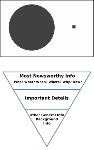
THE INVERTED PYRAMID OF WRITING Establishing hierarchy in a design is similar to the way journalists use the inverted pyramid of writing. The most important news is all in the first paragraph or two. The lead covers the who, what, where, when, why and how. It tells you everything you need to know. |
